Ladyfingers
The boring details...
Logo design
Two versions of the logo was created. A version for use on dark backgrounds, and one for white backgrounds. Both versions was used on the website, as we needed to change the color of the logo when the burger-menu was opened.
The physical store front had a old, hard-to-see, rusty Logo. The idea was to replace this with a Logo that was easier to notice. This idea was not implemented, but is illustrated here. The logo was, however, still used on the website.
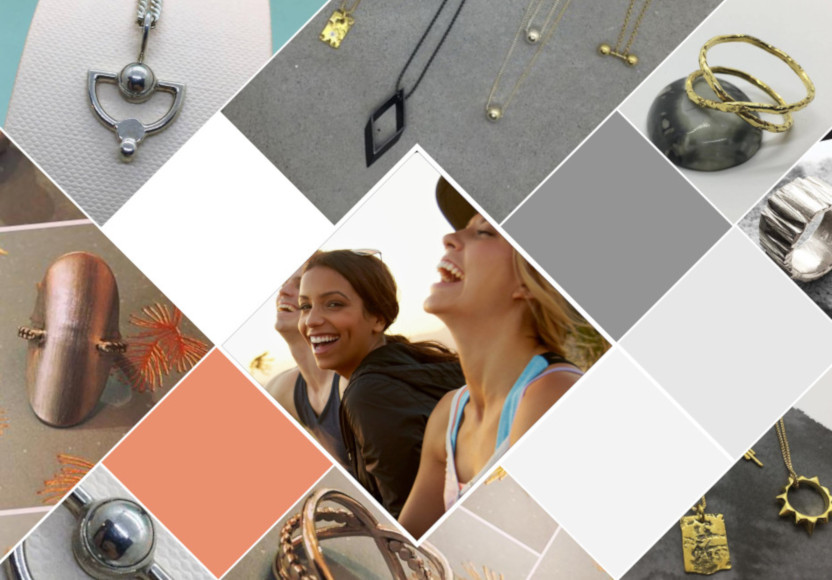
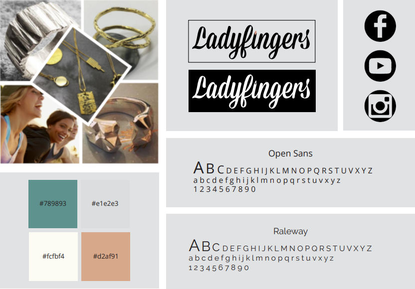
Mood board and Style tile
We created a mood board and style tile to help guide us in the design process.
Video
Video material was recorded in the form of b-rolls, and later compiled into a website header-video: